A Distant Reading of my Autosomes

It’s amazing what spit in a vial can tell you.

When I mailed off the AncestryDNA kit, I figured I already knew the results, barring any family-shattering revelations. (One student I had at Syracuse, a Methodist, told me he turned out to be damn near half Jewish.) I, on the other hand, knew what the thousand-foot view should look like, if not the granular details.

My father has green eyes and sandy hair and, as far as family lore goes, is a British Isles mongrel. My mother is not two full generations out of Mexico; both her paternal and maternal sides are 100% Mexican. On average, Mexicans exhibit a 60/40 ancestral split between Europe and indigenous America (per Analabha Basu et al 2008). So, assuming my mother = 60/40 Spaniard/Amerind split, and assuming my father = 100 Northern European, I assumed, to a rough approximation, that I’d be an 80/20 Euro/Amerind mix. (In the parlance of Oklahomans, I assumed I’d be “1/5 Cherokee”.)

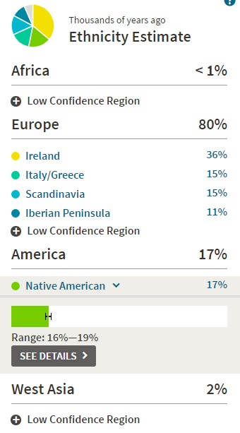
AncestryDNA returned no major surprises. I’m 80% European, 16-19% Amerind. 

ancestryoverview

Paternal.

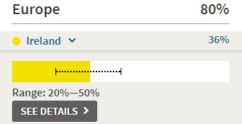
Mostly Irish, some Scandinavian, trace amounts of British/W. European.

Quite surprised at how Irish the results say I am. I assumed plenty of English, plus a wonderfully American smattering of other Northern, Western, and Central European ancestral regions. I assumed wrongly.

irish.jpg

23andMe does not differentiate between English and Irish, but according to AncestryDNA’s white paper, their reference panel is thus differentiated. Here’s the PCA for their European reference panel.

pca

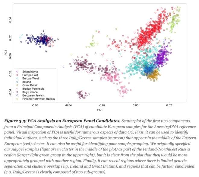
The dark blue/orange cluster is the Irish/English cluster. They’re damn close but distinct enough. In fact, according to the same white paper, Ancestry’s methods have an 80+% accuracy rate for correctly putting the Irish in Ireland (their methods are actually not great at differentiating England and Western Europe).

accuracy

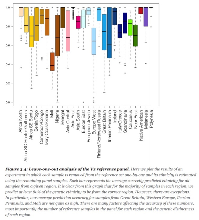
Note: In bar graph above, the shorter the bar, the better the predictive accuracy.

Interesting genetic detail. Irish! In my opinion, however, AncestryDNA’s “Irish” ancestral region should be labeled the “Celtic” ancestral region, for it also includes Scotland, Wales, and the borderlands.

celtic

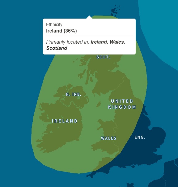
So, my father is almost entirely of Celtic stock. I guess that makes me a halfbreed Celt. I had expected a non-trivial amount of English and W. Euro ancestry, but I have only trace amounts of it.

brits

As far as the 15% Scandinavian: According to AncestryDNA, “Scandinavian” shows up in a lot of British Islanders, and I’m no exception. It’s not “Viking” DNA necessarily, but it could be pretty deep ancestry that can’t be traced back “genealogically.” AFAIK, I have no recent Scandinavian surnames in my paternal lineage.

Maternal.

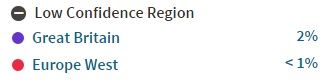
Southern European (Spanish/Italian) and Amerindian. What else did you expect from a Mexican?

Surprised to see the Southern European ancestry isn’t a neat Iberian chunk. It’s split all along the Mediterranean, from Spain to Greece. AncestryDNA isn’t great at figuring out Southern European ancestry, particularly from the Iberian peninsula (see the bar graph accuracy rates above—only 50% for Iberia!).

mediterranean

16-19% confidence range for the Native American ancestry. There are tools to locate that ancestry into “tribal” regions, so it’ll be interesting to determine in the coming months if it’s Mayan or Aztecan. Almost certainly the latter, given the region in which my recent-ish maternal ancestors lived:

zacatecas

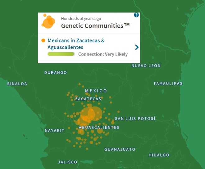
Central Mexico. Aguascalientes and Zacatecas. Far too north for the Mayans. Zacatecas comes from the Aztec word zacatl. Doesn’t mean my native ancestors were Aztec. That would be bad ass, but they just as likely could have been from the less civilized nomadic tribes the Aztecs called chichimeca, or barbarians.

The fact that my recent-ish Mexican ancestors are from Zacatecas and Aguascalientes fits well with my family history. Like many third and fourth generation Mexicans, my greats and grandparents came over in the 1910s and 1920s, during the Mexican Revolution. And, indeed, Zacatecas/Aguascalientes was the site of some of the Revolution’s most brutal fighting and was thus a prime source of origin for early 20th century Mexican immigrants.

Also, according to Wikipedia, San Luis Potosi, which is right next door to Zacatecas, is home to a non-trivial number of Italians. This might explain why my Southern Euro ancestry has an Italian component. Cross-state dalliances.

On the same Italian note, Ancestry provides you with cousin matches out to the sixth degree, for people who have also taken the test and appear to be related to you. Popping up in my matches are several people from the Italo-Mexican region of San Luis Potosi! Fourth and fifth cousins, extremely high probability. Only one of them has a picture; I won’t post it here, but she looks very Italian, not at all mestizo.

There’s some African and Middle Eastern noise, which, if legit, certainly comes from my mother’s side.

africamideast

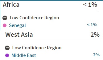
On average (again, per Analabha Basu et al.), Mexicans exhibit a small amount—roughly 4%—of African ancestry, a legacy of slavery sur de la frontera. Makes sense that a tiny amount would end up in my maternal lineage.

The Middle Eastern trace is probably a pulse from the Old World (Je Suis Charles Martel). It’s possible the M.E. trace could have sperm’ed or egg’ed its way into my lineage in Mexico, but since Lebanese and other Arabs didn’t start arriving in Mexico until the late 19th century, I doubt that’s the case.

Raw data. 

This is just the beginning. I’ve downloaded my 700,000 SNPs and indels and am looking forward to uploading the data to other tools to match against other databases. I’ll also be looking for ways these genetic testing algorithms might be valuable for analysis of large textual data sets.


Relinquishing Control

Responding to Allington et. al’s argument that the digital humanities are a handmaiden to neoliberalism and non-progressive scholarship, Juliana Spahr, Richard So, and Andrew Piper respond that DH and progressive scholarship are not in fact incommensurable. Without getting too deep into the many contours of the debate, I want to suggest in this post what I think may be the hidden crux of the argument (though I doubt the authors of either essay would agree with me).

Spahr et al.:

Ultimately what has most troubled us about Allington et al’s essay is its final line, which is its core assertion: they call on colleagues in the humanities to resist the rise of the digital humanities. They have carefully studied the field of the digital humanities and declare that it must be shut down; nothing good can come from it. We worry about this foreclosing of possibility. Other academic disciplines, such as sociology, have benefited greatly from the merging of critical and computational modes of analysis, particularly in overturning entrenched notions of gender or racial difference based on subjective bias. We find it is too early to reject in toto the use of digital methods for the humanities.

The urgent questions articulated by “Neoliberal Tools” thus present a rich opportunity to think about the field’s methodological potential. Questions about the over-representation of white men or the disproportionate lack of politically progressive scholarship in the digital humanities regard inequality and have a strong empirical basis. As such, they cannot be fully answered using the critical toolbox of current humanistic scholarship. These concerns are potentially measurable, and in measuring them, the full immensity of their impact becomes increasingly discernable, and thus, answerable. The informed and critical use of quantitative and computational analysis would thus be one way to add to the disciplinary critique that the authors themselves wish to see.

In these final paragraphs, the authors make the  move—an almost imperceptible move, but I think I can detect it—that anyone in the hard or social sciences must also make: they separate data from explanations for data. This, in my view, is what makes the ostensibly “progressive” or “activist” goals of some humanities scholarship somewhat incommensurable with computational work as such.

Questions about equality, the authors note, are questions that require large-scale measurement; they are not questions one can address adequately through close readings or selective anecdotes, which they describe as “the critical toolbox of current humanistic scholarship.” What they do not note—but I think it’s a point Allington et al. might eventually get around to making in a counter-argument—is that when you exchange a close, humanistic analysis for a data-driven one, then to a certain extent you relinquish control over the “correct” way to explain or theorize the resultant measurements. Indeed, our results, we now recognize, are far too easily “rationalized” with just-so stories that fit our pre-conceived notions (which isn’t to say that some just-so stories aren’t also true stories, or that some just so-stories aren’t truer than others).

“The data’s the data,” a biologist friend of mine once said. “It’s how you explain the data that gives rise to debates.”

Take Ted Underwood’s piece on gender representation in fiction, which Spahr et al. point to as an example of critical/computational scholarship. Underwood writes that between 1800 and 1989,  the words associated with male vs. female characters are volatile and in fact become more volatile in the twentieth century, making it more difficult for models to predict whether a set of words is being applied to a male or a female. “Gender,” he concludes, “is not at all the same thing in 1980 that it was in 1840.”

“Ah, gender is fluid,” we might conclude. Solid computational evidence for feminist theory. But then Underwood makes the data-grounded move, noting that cause(s) of the trend are open to interpretation and further data exploration:

The convergence of all these lines on the right side of the graph helps explain why our models find gender harder and harder to predict: many of the words you might use to predict it are becoming less common (or becoming more evenly balanced between men and women — the graphs we’ve presented here don’t yet distinguish those two sorts of change.)

Whether previously gendered terms converge toward both male and female characters, or whether gender-predicting terms simply disappear in fiction, could very much make a difference from the standpoint of explanation, especially critical or political explanation. E.g., one could claim, given the latter case (disappearance of gender-predicting terms), that what we see at work is the ignoring of gender rather than the fluid reframing of it, an effect, say, of feminism on fiction but not in any sense a confirmation of the essential fluidity of gender. However, it would also be perfectly feasible to use either explanation to forward a more critical or activist-minded thesis. It could go either way. And there’s the rub. When you’re doing computational work, you cannot also at the same time be explaining your results. Explanation is step two, and it’s a step people can take in different directions, politically friendly, politically unfriendly, or politically neutral.

And if the computational work you’re doing is interesting, you should at least sometimes find things that overturn your preconceived notions.  For example, Underwood notes that despite the general trend away from sharply-delineated gender descriptions, there are some important counter-trends.

On balance, that’s the prevailing trend. But there are also a few implicitly gendered forms of description that do increase. In particular, physical description becomes more important in fiction (Heuser and Le-Khac 2012).

And as writers spend more time describing their characters physically, some aspects of the body and dress also become more important as signifiers of gender. This isn’t a simple, monolithic process. There are parts of the body whose significance seems to peak at a certain date and then level off — like the masculine jaw, maybe peaking around 1950?

Other signifiers of masculinity — like the chest, and incidentally pockets — continue to become more and more important. For women, the “eyes” and “face” peak very markedly around 1890. But hair has rarely been more gendered (or bigger) than it was in the 1980s.

Rethinking things, perhaps we don’t see evidence that “gender is fluid” so much as evidence that gender remains sharply delineated, just along a different terminological axis than was previously the case. Or not. You could argue something else, too. Again, that’s the point.

As another example of what I’m talking about, we can look at Juliana Spahr’s and Stephanie Young’s work on the demographics of MFA and English PhD programs. It is an excellent piece, tied resolutely to statistics, but it ends this way:

We have ended this article many different ways, made various arguments about what is or what might be done. These arguments now seem either inadequate (reformist) or unrealistic (smash the MFA, the AWP, the private foundations, the state). At moments we struggled with our own structural positions even as these structures were created without our consent but to our advantage . . .

. . . we agree with McGurl when he argues that “[w)hat is needed now […] are studies that take the rise and spread of the creative writing program not as an occasion for praise or lamentation but as an established fact in need of historical interpretation: how, why, and to what end has the writing program reorganized U.S. literary production in the postwar period?” For us, for now, the best we can do is work to understand so that, when we create alternatives to the program, they do not amplify its hierarchies.

More research needed, in other words. Any previous calls to activism muted.

Spahr and Young do a wonderful job compiling relevant demographic information, but in so doing, they rightly recognize that interpreting the information (both historically and in the present moment) is another job altogether. The data are separated from their explanation. Spahr and Young are, I imagine, on the political left, but their data remain open to explanation from multiple political or apolitical perspectives.

From an apolitical perspective, I would want to explain some of their demographic data with simple demography. For example, they imply that 29% non-white representation in English PhD programs is not enough, but America is precisely 29% non-white and 71% white, so I don’t find that statistic problematic at all. I would also claim that this same demographic point partially ameliorates the 18% non-white representation in MFA programs, though obviously, a gap in representation remains. How to explain it, though? Their essay is (rightly) not ideological enough to foreclose on all but a single, left-facing window of possibility. This is a good thing. Recognizing the possibility of multiple explanations is what keeps a field of inquiry from becoming an ideological echo-chamber.

Spahr et al. also point to sociology as a field that uses computational methods to address critical, cultural questions. But again, addressing critical or cultural questions with computational methods is not at all the same thing as being critical, culturally progressive, or activist. Sociologists (and psychologists) have, I think, always recognized, if only quietly, that progressive or activist readings of their data are by no means the only readings. Steven Pinker and Jon Haidt, among others, are really pushing the point lately with their Heterodox Academy. It’s all a big debate, of course, but that’s the point.

In my view, good computational scholarship opens up debate and rarely points to One Single And Obvious And You’re Stupid If You Don’t Believe It conclusion. Sometimes it does, but that’s usually in the context of not-immediately-political content (e.g., whether or not Piraha possesses recursive syntax). But when you’re talking about large social or political explanations, I’ve never seen the explanation that doesn’t leave me thinking: Mm. Maybe. Interesting. I dunno. We’ll see.

I’m sure my skepticism comes across as conservatism to some. From my perspective as a scholar, however, I’m simply tentative about my own worldview. I’m therefore deeply suspicious of any scholar or study purporting to provide 100% support for any particular ideology or political platform. So I think it’s a good thing that a lot of DH work doesn’t do that. Indeed, I’m drawn most often to theories that piss off everyone across the political spectrum—e.g., Gregory Clark’s work—because my most deeply held prior is that the world as it is probably won’t conform very often to any particular ideology or politics. If anything, then, I’d like to see more DH work not confirming a single orthodoxy but challenging many orthodoxies all at once. Then I’ll be confident it’s doing something right.


Readability formulas

Readability scores were originally developed to assist primary and secondary educators in choosing texts appropriate for particular ages and grade levels. They were then picked up by industry and the military as tools to ensure that technical documentation written in-house was not overly difficult and could be understood by the general public or by soldiers without formal schooling.

There are many readability metrics. Nearly all of them calculate some combination of characters, syllables, words, and sentences; most perform the calculation on an entire text or a section of a text; a few (like the Lexile formula) compare individual texts to scores from a larger corpus of texts to predict a readability level.

The most popular readability formulas are the Flesch and Flesch-Kincaid.

FleschReadingEaseForumula

Flesch readability formula


FleschKincaidGradeFormula

Flesch-Kincaid grade level formula

The Flesch readability formula (last chapter in the link) results in a score corresponding to reading ease/difficulty. Counterintuitively, higher scores correspond to easier texts and lower scores to harder texts. The highest (easiest) possible score tops out around 120, but there is no lower bound to the score. (Wikipedia provides examples of sentences that would result in scores of -100 and -500.)

The Flesch-Kincaid grade level formula was produced for the Navy and results in a grade level score, which can be interpreted also as the number of years of education it would take to understand a text easily. The score has a lower bound in negative territory and no upper bound, though scores in the 13-20 range can be taken to indicate a college or graduate-level “grade.”

So why am I talking about readability scores?

One way to understand”distant reading” within the digital humanities is to say that it is all about adopting mathematical or statistical operations found in the social, natural/physical, or technical sciences and adapting them to the study of culturally relevant texts. E.g., Matthew Jocker’s use of the Fourier transform to control for text length; Ted Underwood’s use of cosine similarity to compare topic models; even topic models themselves, which come out of information retrieval (as do many of the methods used by distant readers); these examples could be multiplied.

Thus, I’m always on the lookout for new formulas and Python codes that might be useful for studying literature and rhetoric.

Readability scores, it turns out, have sometimes been used to study presidential rhetoric—specifically, they have been used as proxies for the “intellectual” quality of a president’s speech-writing. Most notably, Elvin T. Lim’s The Anti-Intellectual Presidency applies the Flesch and Flesch-Kincaid formulas to inaugurals and States of the Union, discovering a marked decrease in the difficulty of these speeches from the 18th to the 21st centuries; he argues that this  decrease should be understood as part and parcel of a decreasing intellectualism in the White House more broadly.

Ten seconds of Googling turned up a nice little Python library—Textstat—that offers 6 readability formulas, including Flesch and Flesch-Kincaid.

I applied these two formulas to the 8 spoken/written SotU pairs I’ve discussed in previous posts. I also applied them to all spoken vs. all written States of the Union, copied chronologically into two master files. Here are the results (S = spoken, W = Written):

SotUFleschScores

Flesch readability scores for States of the Union. Lower score = more difficult.

SotUFleschKincaidGrades

Flesch-Kincaid grade level scores for States of the Union.

The obvious trend uncovered is that written States of the Union are a bit more difficult to read than spoken ones. Contra Rule et al. (2015), this supports the thesis that medium matters when it comes to presidential address. Presidents simplify (or as Lim might say, they “dumb down”) their style when addressing the public directly; they write in a more elevated style when delivering written messages directly to Congress.

For the study of rhetoric, then, readability scores can be useful proxies for textual complexity. It’s certainly a useful proxy for my current project studying presidential rhetoric. I imagine they could be useful to the study of literature, as well, particularly to the study of the literary public and literary economics. Does “reading difficulty” correspond with sales? with popular vs. unknown authors? with canonical vs. non-canonical texts? Which genres are more “difficult” and which ones “easier”?

Of course, like all mathematical formula applied to culture, readability scores have obvious limitations.

For one, they were originally designed to gauge the readability of texts at the primary and secondary levels; even when adapted by the military and industry, they were meant to ensure that a text could be understood by people without college educations or even high school diplomas. Thus, as Begeny et al. (2013) have pointed out, these formulas tend to break down when applied to complex texts. Flesch-Kincaid grade level scores of 6 vs. 10 may be meaningful, but scores of, say, 19 vs. 25 would not be so straightforward to interpret.

Also, like most NLP algorithms, the formulas take as inputs things like characters, syllables, and sentences and are thus very sensitive to the vagaries of natural language and the influence of individual style. Steinbeck and Hemingway aren’t “easy” reads, but because both authors tend to write in short sentences and monosyllabic dialogue, their texts are often given scores indicating that 6th grades could read them, no problem. And authors who use a lot of semi-colons in place of periods may return a more difficult readability score than they deserve, since all of these algorithms equate long sentences with difficult reading. (However, I imagine this issue could be easily dealt with by marking semi-colons as sentence dividers.)

All proxies have problems, but that’s never a reason not to use them. I’d be curious to know if literary scholars have already used readability scores in their studies. They’re relatively new to me, though, so I look forward to finding new uses for them.


Cosine similarity parameters: tf-idf or Boolean?

In a previous post, I used cosine similarity (a “vector space model”) to compare spoken vs. written States of the Union. In this post, I want to see whether and to what extent different metrics entered into the vectors—either a Boolean entry or a tf-idf score—change the results.

First, here’s a brief recap of cosine similarity: One way to quantify the similarity between texts is to turn them into term-document matrices, with each row representing one of the texts and each column representing every word that appears in both of the texts. (The matrices will be “sparse” because each text contains only some of the words across both texts.) With these matrices in hand, it is a straightforward mathematical operation to treat them as vectors in Euclidean space and calculate their cosine similarity with the Euclidean dot product formula, which returns a metric between 0 and 1, where 0 = no words shared and 1 = exact copies of the same text.

. . . But what exactly goes into the vectors in these matrices? Not words from the two texts under comparison, obviously, but numeric representations of the words. The problem is that there are different ways to represent words as numbers, and it’s never clear which is the best way. When it comes to vector space modeling, I have seen two common methods:

The Boolean method: if a word appears in a text, it is represented simply as a 1 in the vector; if a word does not appear in a text, it is represented as a 0.

The tf-idf method: if a word appears in a text, its term frequency-inverse document frequency is calculated, and that frequency score appears in the vector; if a word does not appear in a text, it is represented as a 0.

In my previous post, I used this Python script (compliments to Dennis Muhlstein) which uses the Boolean method. Tf-idf scores control for document length, which is important sometimes, but I wasn’t sure if I wanted to ignore length when analyzing the States of the Union—after all, if a change in medium induces a change in a speech’s length, that’s a modification I’d like my metrics to take note of.

But how different would the results be if I had used tf-idf scores in the term-document matrices, that is, if I had controlled for document length when comparing written vs. spoken States of the Union?

Using Scikit-learn’s TfidfVectorizer and its cosine similarity function (part of the pairwise metrics module), I again calculated the cosine similarity of the written and spoken addresses, but this time using tf-idf scores in the vectors.

The results of both methods—Boolean and tf-idf—are graphed below.

CosineSimComparison

I graphed the (blue) tf-idf measurements first, in decreasing order, beginning with the most similar pair (Nixon’s 1973 written/spoken addresses) and ending with the most dissimilar pair (Eisenhower’s 1956 addresses). Then I graphed the Boolean measurements following the same order. I ended each line with a comparison of all spoken and all written States of the Union (1790 – 2015) copied chronologically into two master files.

In general, both methods capture the same general trend though with slightly different numbers attached to the trend. In a few cases, these discrepancies seem major: With tf-idf scores, Nixon’s 1973 addresses returned a cosine similarity metric of 0.83; with Boolean entries, the same addresses returned a cosine similarity metric of 0.62. And when comparing all written/spoken addresses, the tf-idf method returned a similarity metric of 0.75; the Boolean method returned a metric of only 0.55

So, even though both methods capture the same general trend, tf-idf scores produce results suggesting that the spoken/written pairs are more similar to each other than do the Boolean entries. These divergent results might warrant slightly different analyses and conclusions—not wildly different, of course, but different enough to matter. So which results most accurately reflect the textual reality?

Well, that depends on what kind of textual reality we’re trying to model. Controlling for length obviously makes the texts appear more similar, so the right question to ask is whether or not we think length is a disposable feature, a feature producing more noise than signal. I’m inclined to think length is important when comparing written  vs. spoken States of the Union, so I’d be inclined to use the Boolean results.

Either way, my habit at the moment is to make parameter adjustment part of the fun of data analysis, rather than relying on the default parameters or on whatever parameters all the really smart people tend to use. The smart people aren’t always pursuing the same questions that I’m pursuing as a humanist who studies rhetoric.

~~~

Another issue raised by this method comparison is the nature of the cosine similarity metric itself. 0 = no words shared, 1 = exact copies of the same text, but that leaves a hell of a lot of middle ground. What can I say, ultimately, and from a humanist perspective, about the fact that Nixon’s 1973 addresses have a cosine similarity of 0.83 while Eisenhower’s 1956 addresses have a cosine similarity of 0.48?

A few days ago I found and subsequently lost and now cannot re-find a Quora thread discussing common-sense methods for interpreting cosine similarity scores, and all the answers recommended using benchmarks: finding texts from the same or a similar genre as the texts under comparison that are commonly accepted to be exceedingly different or exceedingly similar (asking a small group of readers to come up with these judgments can be a good idea here). So, for example, if using this method on 19th century English novels, a good place to start would be to measure, say, Moby Dick and Pride and Prejudice, two novels that a priori we can be absolutely sure represent wildly different specimens from a semantic and stylistic standpoint.

And indeed, the cosine similarity of Melville’s and Austen’s novels is only 0.24. There’s a dissimilarity benchmark set. At the similarity end, we might compute the cosine similarity of, say, Pride and Prejudice and Sense and Sensibility.

Given that my interest in the State of the Union corpus has more to do with mode of delivery than individual presidential style, I’m not sure how to go about setting benchmarks for understanding (as a humanist) my cosine similarity results—I’m hesitant to use the “similarity cline” apparent in the graph above because that cline is exactly what I’m trying to understand.


An Attempt at Quantifying Changes to Genre Medium, cont’d.

Cosine similarity of all written/oral States of the Union is 0.55. A highly ambiguous result, but one that suggests there are likely some differences overlooked by Rule et al. (2015). A change in medium should affect genre features, if only at the margins. The most obvious change is to length, which I pointed out in the last post.

But how to discover lexical differences? One method is naive Bayes classification. Although the method has been described for humanists in a dozen places at this point, I’ll throw my own description into the mix for posterity’s sake.

Naïve Bayes classification occurs in three steps. First, the researcher defines a number of features found in all texts within the corpus, typically a list of the most frequent words. Second, the researcher “shows” the classifier a limited number of texts from the corpus that are labeled according to text type (the training set). Finally, the researcher runs the classifier algorithm on a larger number of texts whose labels are hidden (the test set). Using feature information discovered in the training set, including information about the number of different text types, the classifier attempts to categorize the unknown texts. Another algorithm can then check the classifier’s accuracy rate and return a list of tokens—words, symbols, punctuation—that were most informative in helping the classifier categorize the unknown texts.

More intuitively, the method can be explained with the following example taken from Natural Language Processing with Python. Imagine we have a corpus containing sports texts, automotive texts, and murder mysteries. Figure 2 provides an abstract illustration of the procedure used by the naïve Bayes classifier to categorize the texts according to their features. Loper et al. explain:

BayesExample

In the training corpus, most documents are automotive, so the classifier starts out at a point closer to the “automotive” label. But it then considers the effect of each feature. In this example, the input document contains the word “dark,” which is a weak indicator for murder mysteries, but it also contains the word “football,” which is a strong indicator for sports documents. After every feature has made its contribution, the classifier checks which label it is closest to, and assigns that label to the input.

Each feature influences the classifier; therefore, the number and type of features utilized are important considerations when training a classifier.

Given the SotU corpus’s word count—approximately 2 million words—I decided to use as features the 2,000 most frequent words in the corpus (the top 10%). I ran NLTK’s classifier ten times, randomly shuffling the corpus each time, so the classifier could utilize a new training and test set on each run. The classifier’s average accuracy rate for the ten runs was 86.9%.

After each test run, the classifier returned a list of most informative features, the majority of which were content words, such as ‘authority’ or ‘terrorism’.

However, a problem . . . a direct comparison of these words is not optimal given my goals. I could point out, for example, that ‘authority’ is twice as likely to occur in written than in oral States of the Union; I could also point out that the root ‘terror’ is found almost exclusively in the oral corpus. Nevertheless, these results are unusable for analyzing the effects of media on content. For historical reasons, categorizing the SotU into oral and written addresses is synonymous with coding the texts by century. The vast majority of written addresses were delivered in the nineteenth century; the majority of oral speeches were delivered in the twentieth and twenty-first centuries. Analyzing lexical differences thus runs the risk of uncovering, not variation between oral and written States of the Union (a function of media) but variation between nineteenth and twentieth century usage (a function of changing style preferences) or differences between political events in each century (a function of history). The word ‘authority’ has likely just gone out of style in political speechmaking; ‘terror’ is a function of twenty-first century foreign affairs. There is nothing about medium that influences the use or neglect of these terms. A lexical comparison of written and oral States of the Union must therefore be reduced to features least likely to have been influenced by historical exigency or shifting usage.

In the lists of informative features returned by the naïve Bayes classifier, pronouns and contraction emerged as two features fitting that requirement.

AllPronounsRelFreq

Relative frequencies of first, second, and third person pronouns

WeUsYouPronounsRelFreq

Relative frequencies of select first and second person pronouns

ContractionsRelFreq

Relative frequencies of apostrophes and negative  contraction

It turns out that pronoun usage is a noticeable locus of difference between written and oral States of the Union. The figures above show relative frequencies of first, second, and third person pronouns in the two text categories (the tallies in the first graph contain all pronomial inflections, including reflexives).

As discovered by the naïve Bayes classifier, first and second person pronouns are much more likely to be found in oral speeches than in written addresses. The second graph above displays particularly disparate pronouns: ‘we’, ‘us’, ‘you’, and to a lesser extent, ‘your’. Third person pronouns, however, surface equally in both delivery mediums.

The third graph shows relative frequency rates of apostrophes in general and negative contractions in particular in the two SotU categories. Contraction is another mark of the oral medium. In contrast, written States of the Union display very little contraction; indeed, the relative frequency of negative contraction in the written SotU corpus is functionally zero (only 3 instances). This stark contrast is not a function of changing usage. Negative contraction is attested as far back as the sixteenth century and was well accepted during the nineteenth century; contraction generally is also well attested in nineteenth century texts (see this post at Language Log). However, both today and in the nineteenth century, prescriptive standards dictate that contractions are to be avoided in formal writing, a norm which Sairio (2010) has traced to Swift and Addison in the early 1700s. Thus, if not the written medium directly, then the cultural standards for the written medium have motivated presidents to avoid contraction when working in that medium. Presidents ignore this arbitrary standard as soon as they find themselves speaking before the public.

The conclusion to be drawn from these results should have been obvious from the beginning. The differences between oral and written States of the Union are pretty clearly a function of a president’s willingness or unwillingness to break the wall between himself and his audience. That wall is frequently broken in oral speeches to the public but rarely broken in written addresses to Congress.

As seen above, plural reference (‘we’, ‘us’) and direct audience address (‘you’, ‘your’) are favored rhetorical devices in oral States of the Union but less used in the written documents. The importance underlying this difference is that both features—plural reference and direct audience address—are deliberate disruptions of the ceremonial distance that exists between president and audience during a formal address. This disruption, in my view, can be observed most explicitly in the use of the pronouns ‘we’ and ‘us’. The oral medium motivates presidents to construct, with the use of these first person plurals, an intimate identification between themselves and their audience. Plurality, a professed American value, is encoded grammatically with the use of plural pronouns: president and audience are different and many but are referenced in oral speeches as one unit existing in the same subjective space. Also facilitating a decrease in ceremonial distance, as seen above, is the use of second person ‘you’ at much higher rates in oral than in written States of the Union. I would suggest that the oral medium motivates presidents to call direct attention to the audience and its role in shaping the state of the nation. In other cases, second person pronouns may represent an invitation to the audience to share in the president’s experiences.

Contraction is a secondary feature of the oral medium’s attempt at audience identification. If a president’s goal is to build identification with American citizens and to shorten the ceremonial distance between himself and them, then clearly, no president will adopt a formal diction that eschews contraction. Contraction—either negative or subject-verb—is the informality marker par excellence. Non-contraction, on the other hand, though it may sound “normal” in writing, sounds stilted and excessively proper in speech; the amusing effect of this style of diction can be witnessed in the film True Grit. In a nation comprised of working and middle class individuals, this excessively proper diction would work against the goals of shortening ceremonial distance and constructing identification. Many scholars have noted Ronald Reagan’s use of contraction to affect a “conversational” tone in his States of the Union, but contraction appears as an informality marker across multiple oral speeches in the SotU corpus. In contrast, when a president’s address takes the form of a written document, maintaining ceremonial distance seems to be the general tactic, as presidents follow correct written standards and avoid contractions. The president does not go out of his way to construct identification with his audience (Congress) through informal diction. Instead, the goal of the written medium is to report the details of the state of the nation in a professional, distant manner.

What I think these results indicate is that the State of the Union’s primary audience changes from medium to medium. This fact is signaled even by the salutations in the SotU corpus. The majority of oral addresses delivered via radio or television are explicitly addressed to ‘fellow citizens’ or some other term denoting the American public. In written addresses to Congress, however, the salutation is almost always limited to members of the House and the Senate.

Two lexical effects of this shift in audience are pronoun choice and the use or avoidance of contraction. ‘We’, ‘us’, ‘you’—the frequency of these pronouns drops by fifty percent or more when presidents move from the oral to the written medium, from an address to the public to an address to Congress. The same can be said for contraction. Presidents, it seems, feel less need to construct identification through these informality markers, through plural and second person reference, when their audience is Congress alone. In contrast, audience identification becomes an exigent goal when the citizenry takes part in the State of the Union address.

To put the argument another way, the SotU’s change in medium has historically occurred alongside a change in genre participants. These intimately linked changes motivate different rhetorical choices. Does a president choose or not choose to construct a plural identification between himself and his audience (‘we’,’us’) or to call attention to the audience’s role (‘you’) in shaping the state of the nation? Does a president choose or not choose to use obvious informality markers (i.e., contraction)? The answer depends on medium and on the participants reached via that medium—Congress or the American people.

~~~

Tomorrow, I’ll post results from two 30-run topic models of the written/oral SotU corpora.

An Attempt at Quantifying Changes to Genre Medium

Rule et al.’s (2015) article on the State of the Union makes the rather bold claim (for literary and rhetorical scholars) that changes to the SotU’s medium of delivery has had no effect on the form of the address, measured as co-occurring word clusters as well as cosine similarity across diachronic document pairs. I’ve just finished an article muddying their results a bit, so here’s the initial data dump. I’ll do it in a series of posts. Full argument to follow, if I can muster enough energy in the coming days to convert an overly complicated argument into a few paragraphs.

First, cosine similarity. Essentially, Rule et al. calculate the cosine similarity between each set of two SotU addresses chronologically—1790 and 1791, 1790 and 1792, 1790, and 1793, and so on—until each address has been compared to all other addresses. They discover high similarity measurements (nearer to 1) across most of the document space prior to 1917 and lower similarity measurements (nearer to 0) afterward, which they interpret as a shift between premodern and modern eras of political discourse. They visualize these measurements in the “transition matrices”—which look like heat maps—in Figure 2 of their article.

Adapting a Python script written by Dennis Muhlestein, I calculated the cosine similarity of States of the Union delivered in both oral and written form in the same year. This occurred in 8 years, a total of 16 texts. FDR in 1945, Eisenhower in 1956, and Nixon in 1973 delivered written messages to Congress as well as public radio addresses summarizing the written messages. Nixon in 1972 and 1974, and Carter in 1978-1980 delivered both written messages and televised speeches. These 8 textual pairs provide a rare opportunity to analyze the same annual address delivered in two mediums, making them particularly appropriate objects of analysis. The texts were cleaned of stopwords and stemmed using the Porter stemming algorithm.

CosineSimilarityMetrics

Cosine similarity of oral/written SotU pairs

The results are graphed above (not a lot of numbers, so there’s no point turning them into a color-shaded matrix, as Rule et al. do). The cosine similarity measurements range from 0.67 (a higher similarity) to 0.40 (a lower similarity). The cosine similarity measurement of all written and all oral SotU texts—copied chronologically into two master .txt files—is 0.55, remarkably close to the average of the 8 pairs measured independently.

There is much ambiguity in these measurements. On one hand, they can be interpreted to suggest that Rule et al. overlooked differences between oral and written States of the Union; the measurements invite a deeper analysis of the corpus. On the other hand, the measurements also tell us not to expect substantial variation.

In the article (to take a quick stab at summarizing my argument) I suggest that this metric, among others, reflects a genre whose stability is challenged but not undermined by changes to medium as well as parallel changes initiated by the medial alteration.

But you’re probably wondering what this cosine similarity business is all about.

Without going into too much detail, vector space models (that’s what this method is called) can be simplified with the following intuitive example.

Let’s say we want to compare the following texts:

Text 1: “Mary hates dogs and cats”
Text 2: “Mary loves birds and cows”

One way to quantify the similarity between the texts is to turn their words into matrices, with each row representing one of the texts and each column representing every word that appears in either of the texts. Typically when constructing a vector space model, stop words are removed and remaining words are stemmed, so the complete word list representing Texts 1 and 2 would look like this:

“1, Mary”, “2, hate”, “3, love”, “4, dog”, “5, cat”, “6, bird”, “7, cow”

Each text, however, contains only some of these words. We represent this fact in each text’s matrix. Each word—from the complete word list—that appears in a text is represented as a 1 in the matrix; each word that does not appear in a text is represented as a 0. (In most analyses, frequency scores are used, such as relative frequency or tf-idf.) Keeping things simple, however, the matrices for Texts 1 and 2 would look like this:

Text 1: [1 0 1 1 1 0 0]
Text 2: [1 1 0 0 0 1 1]

Now that we have two matrices, it is a straightforward mathematical operation to treat these matrices as vectors in Euclidean space and calculate the vectors’ cosine similarity with the Euclidean dot product formula, which returns a similarity metric between 0 and 1. (For more info, check out this great blog series; and here’s a handy cosine similarity calculator.)

CosSimFormula

The cosine similarity of the matrices of Text 1 and Text 2 is 0.25; we could say that the texts are 25% similar. This number makes intuitive sense. Because we’ve removed the stopword ‘and’ from both texts, each text is comprised of four words, with one word shared between them—

Text 1: “Mary hates dogs cats”
Text 2: “Mary loves birds cows”

—thus resulting in the 0.25 measurement. Obviously, when the texts being compared are thousands of words long, it becomes impossible to do the math intuitively, which is why vector space modeling is a valuable tool.

~~~

Next, length. Rule et al. use tf-idf scores and thus norm their algorithms to document length. As a result, their study fails to take into account differences in SotU length. However, the most obvious effect of medium on the State of the Union has been a change in raw word count: the average length of all written addresses is 11,057 words; the average length of all oral speeches is 4,818 words. Below, I visualize the trend diachronically. As a rule, written States of the Union are longer than oral States of the Union.

SotUWordCountByYear.jpg

State of the Union word counts, by year and medium

The correlation between medium and length is most obvious in the early twentieth century. In 1913, Woodrow Wilson broke tradition and delivered an oral State of the Union; the corresponding drop in word count is immediate and obvious. However, the effect is not as immediate at other points in the SotU’s history. For example, although Wilson began the oral tradition in 1913, both Coolidge and Hoover returned to the written medium from 1924 – 1932; Wilson’s last two speeches in 1919 and 1920 were also delivered as written messages; nevertheless, these written addresses do not correspond with a sudden rebound in SotU length. None of the early twentieth century written addresses is terribly lengthy, with an average near 5,000.

The initial shift in 1801 from oral to written addresses also fails to correspond with an obvious and immediate change in word count. The original States of the Union were delivered orally, and these early documents are by far the shortest. However, when Thomas Jefferson began the written tradition in 1801, SotU length took several decades to increase to the written mean.

Despite these caveats, the trend remains strong: the oral medium demands a shorter State of the Union, while the written medium tends to produce lengthier documents. To date, the longest address remains Carter’s 1981 written message.

~~~

More later. Needless to say, I believe there are formal differences in the SotU corpus (~2 million words) that seem to correlate with medium. However, as I’ll show in a post tomorrow, they’re rather granular and were bound to be overlooked by Rule et al.’s broad-stroke approach.

Structuralist Methods in a Post-Structuralist Humanities

The topic of this conference (going on now!) at Utrecht University raises an issue similar to the one raised in my article at LSE’s Impact Blog: DH’ists have been brilliant at mining data but not always so brilliant at pooling data to address the traditional questions and theories that interest humanists. Here’s the conference description (it focuses specifically on DH and history):

Across Europe, there has been much focus on digitizing historical collections and on developing digital tools to take advantage of those collections. What has been lacking, however, is a discussion of how the research results provided by such tools should be used as a part of historical research projects. Although many developers have solicited input from researchers, discussion between historians has been thus far limited.

The workshop seeks to explore how results of digital research should be used in historical research and to address questions about the validity of digitally mined evidence and its interpretation.

And here’s what I said in my Impact Blog article, using as an example my own personal hero’s research in literary geography:

[Digital humanists] certainly re-purpose and evoke one another’s methods, but to date, I have not seen many papers citing, for example, Moretti’s actual maps to generate an argument not about methods but about what the maps might mean. Just because Moretti generated these geographical data does not mean he has sole ownership over their implications or their usefulness in other contexts.

I realize now that the problem is still one of method—or, more precisely, of method incompatibility. And the conference statement above gets to the heart of it.

Mining results with quantitative techniques is ultimately just data gathering; the next and more important step is to build theories and answer questions with that data. The problem is, in the humanities, that moving from data gathering to theory building forces the researcher to move between two seemingly incommensurable ways of working. Quantitative data mining is based on strict structuralist principles, requiring categorization and sometimes inflexible ontologies; humanistic theories about history or language, on the other hand, are almost always post-structuralist in their orientation. Even if we’re not talking Foucault or Derrida, the tendency in the humanities is to build theories that reject empirical readings of the world that rely on strict categorization. The 21st century humanistic move par excellence is to uncover the influence of “socially constructed” categories on one’s worldview (or one’s experimental results).

On Twitter, Melvin Wevers brings up the possibility of a “post-structuralist corpus linguistics.” To which James Baker and I replied that that might be a contradiction in terms. To my knowledge, there is no corpus project in existence that could be said to enact post-structuralist principles in any meaningful way. Such a project would require a complete overhaul of corpus technology from the ground up.

So where does that leave the digital humanities when it comes to the sorts of questions that got most of us interested in the humanities in the first place? Is DH condemned forever to gather interesting data without ever building (or challenging) theories from that data? Is it too much of an unnatural vivisection to insert structural, quantitative methods into a post-structuralist humanities?

James Baker throws an historical light on the question. When I said that post-structuralism and corpus linguistics are fundamentally incommensurable, he replied with the following point:

And he suggested that in his own work, he tries to follow this historical development:

Structuralism/post-structuralism exists (or should exist) in dialectical tension. The latter is a real historical response to the former. It makes sense, then, to enact this tension in DH research. Start out as a positivist, end as a critical theorist, then go back around in a recursive process. This is probably what anyone working with DH methods probably does already. I think Baker’s point is that my “problem” posed above (structuralist methods in a post-structuralist humanities) isn’t so much a problem as a tension we need to be comfortable living with.

Not all humanistic questions or theories can be meaningfully tackled with structuralist methods, but some can. Perhaps a first step toward enacting the structuralist/post-structuralist dialectical tension in research is to discuss principles regarding which topics are or are not “fair game” for DH methods. Another step is going to be for skeptical peer reviewers not to balk at structuralist methods by subtly trying to remove them with calls for more “nuance.” Searching out the nuances of an argument—refining it—is the job of multiple researchers across years of coordinated effort. Knee-jerk post-structuralist critiques (or requests for an author to put them in her article) are unhelpful when a researcher has consciously chosen to utilize structuralist methods.

Some questions about centrality measurements in text networks

Centrality

This .gif alternates between a text network calculated for betweenness centrality (smaller nodes overall) and one calculated for degree centrality (larger nodes). It’s normal to discover that most nodes in a network possess higher degree than betweenness centrality. However, in the context of human language, what precisely is signified by this variation? And is it significant?

Another way of posing the question is to ask what exactly one discovers about a string of words by applying centrality measurements to each word as though it were a node in a network, with edges between words to the right or left of it. The networks in the .gif visualize variation between two centrality measurements, but there are dozens of others that might have been employed. Which centrality measurements—if any—are best suited for textual analysis? When centrality measurements require the setting of parameters, what should those parameters be, and are they dependent on text size? And ultimately, what literary or rhetorical concept is “centrality” a proxy for? The mathematical core of a centrality measurement is a distance matrix, so what do we learn about a text when calculating word proximity (and frequency of proximity, if calculating edge weight)? Do we learn anything that would have any relevance to anyone since the New Critics?

It is not my goal (yet) to answer these questions but merely to point out that they need answers. DH researchers using networks need to come to terms with the linear algebra that ultimately generates them. Although a positive correlation should theoretically exist between different centrality measurements, differences do remain, and knowing which measurement to utilize in which case should be a matter of critical debate. For those using text networks, a robust defense of network application in general is needed. What is gained by thinking about text as a word network?

In an ideal case, of course, the language of social network theory transfers remarkably well to the language of rhetoric and semantics. Here is Linton C. Freeman discussing the notion of centrality in its most basic form:

Although it has never been explicitly stated, one general intuitive theme seems to have run through all the earlier thinking about point centrality in social networks: the point at the center of a star or the hub of a wheel, like that shown in Figure 2, is the most central possible position. A person located in the center of a star is universally assumed to be structurally more central than any other person in any other position in any other network of similar size. On the face of it, this intuition seems to be natural enough. The center of a star does appear to be in some sort of special position with respect to the overall structure. The problem is, however, to determine the way or ways in which such a position is structurally unique.

Previous attempts to grapple with this problem have come up with three distinct structural properties that are uniquely possessed by the center of a star. That position has the maximum possible degree; it falls on the geodesics between the largest possible number of other points and, since it is located at the minimum distance from all other points, it is maximally close to them. Since these are all structural properties of the center of a star, they compete as the defining property of centrality. All measures have been based more or less directly on one or another of them . . .

Addressing the notions of degree and betweenness centrality, Freeman says the following:

With respect to communication, a point with relatively high degree is somehow “in the thick of things”. We can speculate, therefore, that writers who have defined point centrality in terms of degree are responding to the visibility or the potential for activity in communication of such points.

As the process of communication goes on in a social network, a person who is in a position that permits direct contact with many others should begin to see himself and be seen by those others as a major channel of information. In some sense he is a focal point of communication, at least with respect to the others with whom he is in contact, and he is likely to develop a sense of being in the mainstream of information flow in the network.

At the opposite extreme is a point of low degree. The occupant of such a position is likely to come to see himself and to be seen by others as peripheral. His position isolates him from direct involvement with most of the others in the network and cuts him off from active participation in the ongoing communication process.

The “potential” for a node’s “activity in communication” . . . A “position that permits direct contact” between nodes . . . A “major channel of information” or “focal point of communication” that is “in the mainstream of information flow.” If the nodes we are talking about are words in a text, then it is straightforward (I think) to re-orient our mental model and think in terms of semantic construction rather than interpersonal communication. In other posts, I have attempted to adopt degree and betweenness centrality to a discussion of language by writing that, in a textual network, a word with high degree centrality is essentially a productive creator of bigrams but not a pathway of meaning. A word with high betweenness centrality, on the other hand, is a pathway of meaning: it is a word whose significations potentially slip as it is used first in this and next in that context in a text.

Degree and betweenness centrality—in this ideal formation—are therefore equally interesting measurements of centrality in a text network. Each points you toward interesting aspects of a text’s word usage.

However, most text networks are much messier than the preceding description would lead you to believe. Freeman, again, on the reality of calculating something as seemingly basic as betweenness centrality:

Determining betweenness is simple and straightforward when only one geodesic connects each pair of points, as in the example above. There, the central point can more or less completely control communication between pairs of others. But when there are several geodesics connecting a pair of points, the situation becomes more complicated. A point that falls on some but not all of the geodesics connecting a pair of others has a more limited potential for control.

In the graph of Figure 4, there are two geodesics linking pi with p3, one EJ~U p2 and one via p4. Thus, neither p2 nor p4 is strictly between p, and p3 and neither can control their communication. Both, however, have some potential for control.

CentralityBlogPost

Calculating betweenness centrality in this (still simple) case requires recourse to probabilities. A probabilistic centrality measure is not necessarily less valuable; however, the concept should give you an idea of the complexities involved in something as ostensibly straightforward as determining which nodes in a network are most “central.” Put into the context of a text network, a lot of intellectual muscle would need to be exerted to convert such a probability measurement into the language of rhetoric and literature (then again, as I write that . . .).

As I said, there is reading to be done, mathematical concepts to comprehend, and debates to be had. And ultimately, what we are after perhaps isn’t centrality measurements at all but metrics for node (word) influence. For example, if we assume (as I think we can) that betweenness centrality is a better metric of node influence than degree centrality, then the .gif above clearly demonstrates that degree centrality may be a relatively worthless metric—it gives you a skewed sense of which words exert the most control over a text. What’s more, node influence is a concept sensitive to scale. Though centrality measurements may inform us about influential nodes across a whole network, they may underestimate the local or temporal influence of less central nodes. Centrality likely correlates with node influence but I doubt it is determinative in all cases. Accessing text (from both a writer’s and a reader’s perspective) is ultimately a word-by-word or phrase-by-phrase phenomenon, so a robust text network analysis needs to consider local influence. A meeting of network analysis and reader response theory may be in order.  Perhaps we are even wrong to expunge functional words from network analysis. As Franco Moretti has demonstrated, analysis of words as seemingly disposable as ‘of’ and ‘the’ can lead to surprising conclusions. We leave these words out of text networks simply because they create messy, spaghetti-monster visualizations. The underlying math, however, will likely be more informative, once we learn how to read it.

Fives

This is in response to Collin Brooke, who asked for some lists of 5.

5 Books On My Desk

  1. The Bourgeois, Franco Moretti.
  2. In the Footsteps of Genghis Khan, John DeFrancis.
  3. Warriors of the Cloisters: The Central Asian Origins of Science in the Medieval World, Christopher Beckwith.
  4. Medieval Rhetoric: A Select Bibliography, James J. Murphy
  5. The Invaders, Pat Shipman

5 Most Played Songs in my iTunes

  1. All Night Long, Lionel Richie
  2. We Are All We Need, Above and Beyond
  3. In My Memory, Tiesto
  4. Two Tickets to Paradise, Eddie Money
  5. We Built This City, Starship

5 Toppings That I Just Put On My Frozen Yogurt

  1. Peanut butter cups
  2. Chocolate chips
  3. M&Ms
  4. cookie dough
  5. whipped cream

5 Alcoholic Beverages In The Kitchen

  1. Bud Lite Lime
  2. Jose Cuervo Silver
  3. Triple-sec
  4. E&J Brandy
  5. Fireball

5 TV Shows on Netflix Instant Que

  1. Mad Men
  2. Human Planet
  3. Don’t Trust the B—- In Apartment 23
  4. Wild India
  5. Blue Planet